The Fate of Fonts
Typography in the 1920s, Part One
Until the 1920s, a printer’s font was selected and combined into words with the intention that the words were going to be read. This assertion may seem axiomatic at first, but, in the modern era, fonts were rethought as elements of graphic design because texts had become an object to gaze upon and not to be closely scrutinized. The Art Deco revolution towards modern fonts went hand-in-hand with the changes in magazine layout which, thanks to print technology, could incorporate images seamlessly and artistically. Free from the stifling grid, artists could reconsider the arrangement and relationship of text and image by equating them in importance. Once the text–letters–fonts–became part of an overall design, it became clear that fonts had to cease their independent existence as letters and become objects in their own right that were a part of the overall design. Old fashioned fonts with their combination of thick lines and thin lines and the accompanying array of bristling serifs simply did not work well with the new dynamics of twentieth-century design. Typography was part of the literate modern world that included books and magazines and advertising and bill boards and posters all demanding attention, and like the rest of the world, old typefaces needed to be updated into modern fonts.
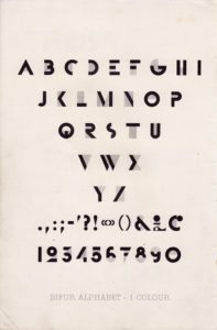
Adolphe Jean-Marie Mouron, who went by the professional nom de plume “Cassandre” (1901-1968), was a famed poster designer and, as one of the pioneers of Art Deco graphic design, was well aware of the need to signify “modern” with words or fonts as well as shapes and formats to the potential consumers of modern stylish products. A Ukrainian exile living and working in Paris, he experimented at will, often using his own fonts, Bifur, for his graphic work for his clients, free to be creative and unhindered by local political needs that he would have encountered in the new Soviet Union. Because he was the co-founder of his own agency, Alliance Graphique, the designer had the good fortune to experiment without the government interference that would later plague the German designers. The German colleagues of Cassandre began with the same clean slate as he had but, by the early 1930s, seemingly innocent fonts became entangled with national identity.

Germany was the home country of the famed inventor of movable type and the printing press, Johannes Gutenberg (1398-1468). Before Gutenberg improved the already existing movable type, printed pages were pressed onto inked woodblocks with raised letters carved out. These white pages with elaborate letters marching across from one side to the other, from top to bottom, or incunabula, very rare and prized today. The printing press could have been invented in Holand or in Germany by the middle of the fifteenth century, but it quickly replaced the manuscript. Called “mechanical writing,” the pages produced by Gutenberg’s very excellent press looked back to the past, to the handwritten manuscripts with hand lettering that dated back to Medieval times. In addition, many, if not most, of the early manuscripts were liturgical in purpose. In fact, in order to pay off his debts, according to Graphic Design History, Gutenberg printed papal indulgences and Bibles. The consumer or reader would not accept a new “book” if it did not look like a manuscript with all of its handwritten authority. The printer replicated the Textura Quadrata, or the “blackletter” font. Almost five hundred years later, Germany was still using the blackletter font for nearly all official printed materials, from magazines to books to government documents.

One of the oddities of modern German was not just that the nation kept a font for hundreds of years old but also that capital letters were used to designate nouns, making any page an uneven jumble of large and small letters with on design logic. As early as the 1820s, there were attempts to reform and update the printing of German, using capital letters for the start of sentences and for proper names only as like the rest of the European languages. By the early twentieth century, it was simply absurd to continue the tradition of replicating the handwritten manuscript lettering of the Medieval period, which was calligraphic, dense and elaborate, and one of the self-imposed tasks of the Bauhaus was to update calligraphy and remake fonts into something suitable for the modern era. Students at the Bauhaus were required to take two semesters of typography and letter design. Their teacher, Joost Schmidt, broke individual letters of the alphabet to their basic elements: a circle, a square, and a rectangle. The goal was to create a universal or international alphabet. The word “international” is significant in this context, for the Bauhaus, as has been noted in previous posts, made itself an outlier in Germany by stressing a neutral international identity over a specific and proud national identity. However, in 1923 when László Moholy-Nagy arrived at the Bauhaus in 1923, the politics of identity seemed far away. The designer concentrated upon the concept of typography as an instrument of “clarity” in the service of the “message.” It is clear that the whole of the graphic design resources of the school was oriented towards reform and those efforts at updating including fonts. In the newly inaugurated the Druck und Reklame (printing and advertising) workshop, Herbert Bayer (1900-1985), a former student at the Bauhaus, was head of this new department.
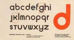
The Director of the art school, Walter Gropius (1883-1969) asked Bayer to design a unique and distinctive typeface that would be the “face” of Bauhaus. The selection of Bayer was a judicious one. The artist had been asked in 1923 by the State of Thuringia to design their new bank notes for a series of million marks bills. Shockingly enough, his design used sans serif type, but two years later, the same government withdrew support from the Bauhaus. Two years later, when Bayer returned in 1925, the school was in a new home, Dessau, and had a new frame of reference. Bayer became head of the typography workshop and decided to create a single font face that would be “universal.” He made a bold leap away from the traditional German blackletter and designed a lower-case only alphabet in which the simplified and reduced font without serifs. which became associated with the Bauhaus and with artistic design. Each letter was constructed with great economy, an arc here, a straight line there, nothing else was necessary. In contrast to the traditional justified right side, Bayer justified only the left side and allowed the right side to be “ragged.” His Universal alphabet did not become “universal,” but the future of fonts would be sans serif, which, like Bayer’s lower case only fonts, was a rebellion against the serif sprouting fraktur and its forest of capital letters. At first, when it came to politics, Bayer proved to be surprisingly open to the blandishments of the Nazis when they came to power. His neutral attitude towards the party of Adolf Hitler was surprising, given that it was the Nazi party that had pushed the Bauhaus out of Weimar, however, for their part, the Nazis were equally flexible in their willingness to hire the former Bauhaus star to do their bidding.

Herbert Bayer’s “Bauhaus” font
As Alice Rawsthorn wrote for The New York Times, “In the 10 years from 1928, when he left the Bauhaus to open a studio in Berlin, until his departure for the United States in 1938, he produced posters, brochures and other promotional material for a succession of government projects. Bayer later tried to erase this period from his biography, describing it as ‘my advertising purgatory..'” It seems that Bayer, like many artists needed the work and could not afford to be political. In the early years, the Nazis cloaked their more evil intentions under programs of rebuilding, but those in power took a dim view of modern art and design. The author continued, “Bayer rapidly became one of Germany’s most prolific commercial designers. But by the mid-1930s, the Nazi regime was increasingly repressive and many of his friends, including the Gropiuses, had left the country. Bayer remained, and worked on high-profile government projects, including the propaganda exhibitions ‘German People, German Work’ and ‘Germany.’ Disapproving though the Nazis were of Modernist design, they were willing to use it whenever it seemed expedient.” However, it was impossible for a modern artist to say in favor with the Nazis indefinitely. By 1938, Bayer had fallen from favor. In 2014 Rawsthorn wrote, “Bayer was desperate to leave Germany, but too broke to do so until Gropius arranged for him to curate an exhibition about the Bauhaus at the Museum of Modern Art in New York. He left for the United States in August 1938…Looking back on his life in Berlin, Bayer admitted to being ‘appalled how blind’ he had been to the horrors of Nazism. He also acknowledged the folly of thinking that designers, artists or anyone else could isolate themselves from politics, as he had tried to do.”
It would be safe to say that Bayer’s alphabet is still the face of the Bauhaus, but, even though his font existed only as a design its impact lingers on. As Sarah Archer wrote in 2015 on a change in the Google font, “Bayer set out to create a typeface that was “universal” and could be deployed in a variety of creative ways, at different scales. Each element was lowercase so that the typeface could be adapted to typewriters, books, posters, and signage — in other words, all the ways in which we interact with type on a daily basis as we navigate the world. The premise that each letter was the same “weight” in typographic terms, that is, the same thickness, meant that each character was interchangeable and thus the process of design and implementation was simplified. Bayer’s original design now exists as Bayer Universal and inspired the related typefaces, Architype Bayer and Architype Schwitters. Google’s new face, “Product Sans,” faintly resembles Bayer’s Universal Alphabet in its heavy, rounded forms, each of which seems to “fit” in a circular fashion over the footprint of the other.” Archer explained the suitability of a “universal” alphabet for a universal search engine like Google: “Why do this at Google, and why now? Bayer and Tschichold, along with their Bauhaus colleagues like architect Walter Gropius, addressed the struggle to reconcile the human, tactile, and affective experiences of design with the aesthetics (and recent ravages) of the Machine Age. How could people expect to navigate a world that was made of cold materials on a giant scale? Though the concerns of World War I-era Europe seem less pressing now, the spirit of those worries is as relevant as ever: our connections to other people, in ways both good and bad, are mediated by technology, gadgets, and data, from our physical location on earth to the way we “appear” online to others. Google’s breadth and scope essentially makes its array of products the 21st-century equivalent of Modernist architecture or mass production: Google is everywhere, unavoidable, greatly beneficial if used right, and it requires the finesse of forward-thinking, humanist designers to make it accessible.”

Herbert Bayer, like his mentor, Walter Gropius, was successful in America where he lived a safe life in a nation where he could enjoy artistic freedom. The goal of the designers of the 1920s was a simple one–to make fonts legible and readable. In other words, while Cassandre was being creative with fonts in France, his German colleagues were reforming nothing less than how their countrymen read and their inventions were out of necessity. In the next part of this topic, the fate of the other designers and designs in England will be discussed.
If you have found this material useful, please give credit to
Dr. Jeanne S. M. Willette and Art History Unstuffed.
Thank you.