Architecture of Commerce
Selling Art Deco
From Spring to Fall of 1925, The International Exhibition of Modern Decorative and Industrial Arts in Paris captured the attention of Europe and visiting dignitaries from America. Like the decade itself, this Fair was both forward looking and backward glancing. After the Great War, there was a general desire to return to normal, to “order,” as Jean Cocteau put it. What the writer, and other commentators who shared his sentiments meant, was a turn towards conservativism and caution. The Twenties was a decade of consolidation in the French art world, a digestion of the troublesome avant-gardes of the pre-war that had to be tamed and recycled as “modern art.” Designers, however, faced more complex challenges. Their bête-noir was Art Nouveau and its now old fashioned elaboration. After a terrible war, such decadence seemed obscene and such exuberance became unbearable in a new age of machines. Kenneth Frampton described Hector Guimard’s famous Métro entrances, which marked the Paris subway stations in these terms: “Constructed like the Crystal Palace out of interchangeable, prefabricated cast iron and glass parts, Guimard created his métro system in opposition to the ruling taste of French classical culture…Guimard’s system flourished, emerging overnight like the manifestation of some organic force, its sinuous green cast-iron tentacles erupting from the subterranean labyrinth to support a variety of barriers, pergolas, maps, hooded light fittings and glazed canopies. These surrealistic ‘dragonfly’s wings’—to quote a contemporary critic—received a mixed, not to say chauvinistic, press, the verdigris colour of their iron supports being regarded as German rather than French.” Frampton was describing one of the three types of entrances designed by the artist–the delightful “dragonfly.”
By the 1920s, the time of such flights of fancy had passed. Art Nouveau and its attachment to nature were simply out of step with the Machine Age. Guimard himself noted, “Nature is a great book from which to draw inspiration..Having myself undertaken this study, I discovered three principles which should have a dominant influence on every architectural work: logic, harmony, and feeling.” When he spoke in 1902, a naturalistic design for the Métro entrances was precisely what the Parisians needed. As Marianne Ström noted in her book, Metro-art in the Metro-polis, “The underground has long been synonymous with anguish, fear, and repulsion. It evokes images of funerals, the dead, and hell-fire, sanctuaries (Lascaux and Altamira) and sorcerers.” She could have added the fact that, in Paris, the underground was an ossuary, the graveyards of millions of unknown city dwellers from hundreds of years. Guimard’s entrances were a welcome touch of beauty that would have welcomed tentative visitors to the new mode of travel. But after the war, such superstitions were stripped away and the public accepted the mechanical and technology, even under the earth. Slowly, one by one, Guimard’s one hundred forty-one lovely passages between light and darkness were removed and it was not until the late 1970s that their artistic value was recognized. Only eighty-six remained after the frenzy of modernizing in the 1960s and 70s.
In Architecture of France, David A. Hanser noted that “..Guimard created a new style in which modern, unconventional materials (iron, steel, brick, glass block, glazed tiles) were used openly and mixed with traditional materials, and in which asymmetry predominated..To some, Guimard’s ‘Metro Style’ was modern; to some it was nightmarish; to others, it represented bad taste..” Also very modern in 1901 was the fact that “Guimard’s entrances were made from a kit of relatively few prefabricated parts of cast iron that could be assembled in a wide number of variations.” Despite the advanced materials and building techniques employed, the entrances, as the author pointed out, caused controversies. Guimard was from Belgium, and the French took a dim view of such a foreign invasion and the architect bowed out of the project by 1902. The Art Nouveau stations themselves continued to be built until 1913, but after the Great War, in ten years, the world had changed and a new style, a rejection of Art Nouveau–Art Deco–arrived.
It should not be assumed, however, that Art Deco was a wholesale rejection of the past. Far from it, Art Deco philosophy rejected its near relative, Art Nouveau, but looked back to a very specific time period for inspiration. As Jared Goss, the historian of French Art Deco noted, the Art Nouveau artists were themselves not particularly good craftspersons and did not understand the relationship between art-for-art’s-sake and mass production. The style became a statement of luxury for the few but could not be easily refitted for broad consumption. According to Goss, “..the commercial failure of Art Nouveau was a national embarrassment, as other nations seemed able to succeed at expanding into a wide consumer based without sacrificing quality. Art Deco Designers rejected the sacrifice of quality for the sake of “art” at the expense of execution and “looked back to the preindustrial past, when guild-trained artisans, with their combined mastery of conception and execution, set international standards for excellence in the applied arts. Because the last generation of artist-craftsmen lived during the reign of Louis-Philippe, many designers chose to relate their own work to that style, although some looked also to the earlier eras of Louis XV, Louis XVI, the Directoire, and the Empire. Indeed historical connection became central to the mission of the Art Deco designers.”
One of the foremost designers was Emile-Jacques Ruhlmann (1879–1933), who, by 1920, shook off the heritage of the past and moved out of Art Nouveau and into Art Deco. While he had been influenced by the arts and crafts movement in general and Art Nouveau in particular, he criticized its mode of production, saying, “A clientele of artists, intellectuals, and connoisseurs of modest means is very congenial, but they are not in a position to pay for all the research, the experimentation, the testing that is needed to develop a new design. Only the very rich can pay for what is new and they alone can make it fashionable. Fashions don’t start among the common people. Along with satisfying a desire for change, fashion’s real purpose is to display wealth.” In other words, despite the apparent luxury of Art Deco objects, each object was designed for mass consumption, or, at least, for educated consumers. In addition, it should be pointed out that Art Deco designs, with their simple lines and geometric aspects, were far better suited to being manufactured than the complex configurations of Art Nouveau. The straightforward shapes of the “moderne” also lent themselves to a “downgrading” of materials used so that the Art Deco “look” could move down the economic chain, so to speak, and attract the vast and lucrative middle-class market. Ruhlmann pointed out that “Whether you want it or not, a style is just a craze. And fashion does not come up from humble backgrounds.” In other words, the designers and the objects in the various French pavilions were intended to educate the public, advertise a new style, and sell merchandise. The Fair was an opportunity to educate the French public–potential customers–on the superiority of Art Deco as modern “taste.”
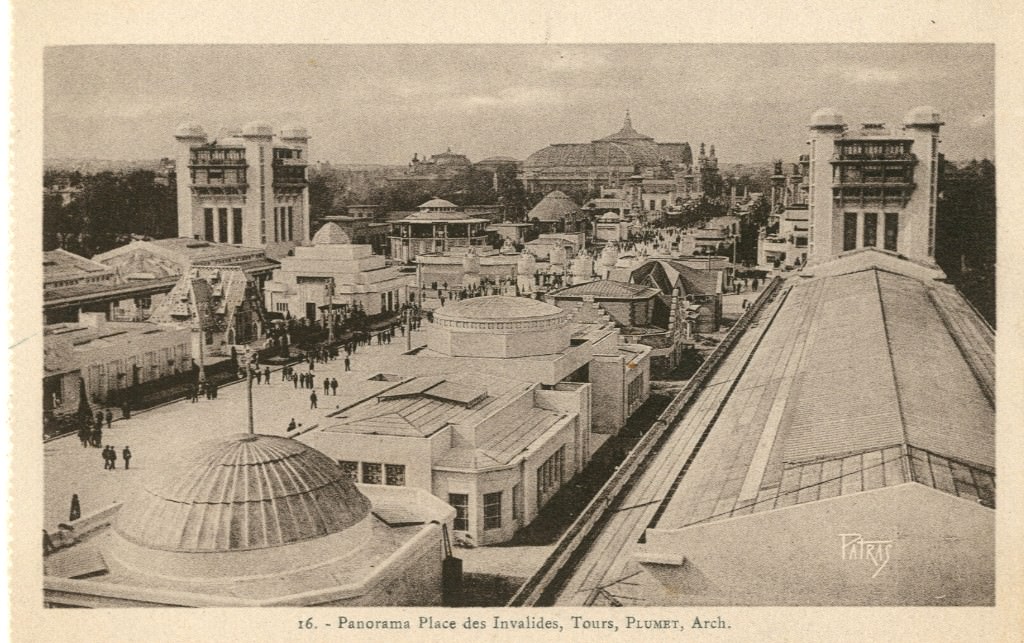
The organization and arrangement of the Fair’s shops, holding an extensive range of merchandise, were laid out in vertical lines, suggesting, to the contemporary eye, an outdoor shopping mall. As the Panorama of the Place des Invalides suggests, a magic carpet of shopping meccas, spread out at the feet of the Fair goers, all to tempt them to shop and to be informed and to learn about the latest styles from famous designers. Christopher Green explained, “In 1925, as in 1900, the middle class were the dominant force in French society; it was they, especially the lesser middle classes known in the 1870s and 1880s as the ‘new strata’ who brought back to power the Radicals in the 1924 Left coalition, the ‘cartel des gauches,’ after half-decade of right-wing dominance in the Chamber from 1919, and brought back with them the rationalist libertarian values of 1900-1914. Indeed, the 1925 Exhibition is one testimony to a mid-twenties desire to remake the image of a new modernity the Belle Epoque, imagined as a time of realized ambitions and sated appetites..” The importance of the “lesser middle classes,” who “worked with their hands” and “aspired socially” was the consumer base for the Art Deco artists. In Art in France, 1900-1940, Green explained that the pavilions appealed to “..the lesser middle classes (who lived in) scaled-down versions of the comfortable households of the bourgeoisie rich. It was its lavish appeal to this kind of social emulation that made of the 1925 Exhibition a popular as well as élite success.” The major sites of desire were the pavilions of the leading department stores of Paris–each structure dedicated to the targeted consumer, females with discretionary income, considered the prime customers of these temples of fashion, art, and design.

In their book on Art Deco, Victoria Charles and Klaus H. Carl discussed the extensive layout provided for the French buildings in the Exposition Internationale des Arts Décoratifs et Industriels Modernes.“The French section comprised two main areas, almost perpendicular to each other, one of them marked by the Seine between the Pont de la Concorde and the ALms Bridge, the other one, leading alongside he Avenue Nicholas II, the Alexandre III Bridge, and the alley bisecting the section cutting across the Esplanade des Invalides from north to south. On the quays of the right bank of the river and the Cours-la-Reine, the visitor would successively encounter the foreign and the French pavilions, then the French Village and the colonial pavilions. On the left bank, some more pavilions, miniature toys presented in a model village, the transport gallery, and the amusement park. On the Esplanade, symmetry, and variety, order and life, obtained by an extremely considered arrangement of buildings, predominately assigned to France. Lastly, in order to connect the two parts of the Exhibition, separated by the Seine and for fear the public would not be tempted to cross from one bank to the other under the summer sun, the Alexandre III Bridge was transformed, from two lines of shops into a kind of Rialto. It was, like certain bridges of the Middle Ages, a street spanning a river..”

The four pavilions of the four great departments stores of Paris were wedged into four corners of the Esplanade des Invalides. The Pavilion for the Printemps department store celebrated the fame of the establishment which had arisen from the urban renewal project of Baron Georges Haussmann in the 1860s. In 1865, the founder, Jules Jaluzot, surveyed the new terrain of Paris and selected the 9th Arrondissement as the site for his new enterprise. A former employee of Le Bon Marché, Jaluzot understood the importance of foot traffic and recognized the convenience of being near the Gare St. Lazare and the covered “passages” or mini malls of the Grandes Boulevards. From the beginning, one of the characteristics of Printemps would be the huge display windows, reminiscent of the old fashioned markets on the streets. The “store” was really an assortment of buildings, starting with a building on Boulevard Haussmann and expanding to several other adjacent structures, all of which were destroyed by a fire in 1881. The original “stores” were expanded when rebuilt, rebounding to greater elegance. Under Jaluzot, the newest department store in Paris, became the most innovative, initiating the idea of a “sale” (les soldes) of older merchandise. Customers were offered a bouquet of violets on the first day of spring and, in the windows, elegantly dressed mannequins–an art form in and of themselves–wore the latest fashions. With the new owner, Gustave Laguionie, who purchased the store in 1905, came more innovations. Laguionie topped the main building with a stunning dome, complete with a terrace. Today it is still possible to sit on the roof terrace and have a meal while surveying all of Paris. The famous dome of the original Printemps roof was made with reinforced concrete, which incorporated glass creations by the artist Réné Lalique. In 1912, another much-copied innovation for Printemps was begun when René Guilleré, the founder of the Société des Artistes décorateurs, suggested the firm initiate a department dedicated to displaying and selling artisanal objects and unique furniture pieces. These art works would be designed by the most fashionable designers of the day, including Guilleré’s wife, Charlotte Chauchet, who would go on the design the interiors for the Pavilion in 1925. Faced with a second fire in 1923 that destroyed the Art Nouveau façade, spiral staircase, and mosaic tiles with their flower motifs were destroyed, Laguionie rebuilt the famous dome, reconstructing it as a stained glass masterwork, again by Lalique. And the “Printemps Haussmann” had another innovation to present: special displays for Christmas in the windows, which were now thought of as sites for installations of merchandise arranged with the care of a museum curator. The notion of holiday window displays was quickly copied by New York department stores.
The Pavilion for the International Exhibition of Modern Decorative and Industrial Arts in 1925 had to be a celebration of the survival and renewal of Printemps, rising like a phoenix from the fires, an advertisement for the first department store to display furniture and design. The architects were as famous as the store itself: Henri Sauvage (1873-1932) and his collaborator Georges Wybo, was was the chief architect of the store itself. Sauvage had been one of the pioneers of Art Deco architecture but also excelled in functionalist architecture and in decoration. He and the architect of the Le Bon Marché Pavilion used the cast iron support columns of the station at Les Invalides which was under the building to support the structures above. As the book, The Architectural Drawings of Henri Sauvage: Architectural works, c. 1905-1931, reported, “Given the fragility of the Invalides Station roof on top of which the building was erected, its was necessary to bear the load on the existing supports by means of reinforced concrete girders carrying the cantilevered pavilion posts.” The Pavilion was dominated by a remarkable frustoconical “dome” that expanded outward from its clipped-off top, enabling the architects to encompass the entire template allotted to them by the officials of the Fair. In fact, as Victoria Charles and Klaus H. Carl pointed out that the architectural use of “..reinforced concrete dominated the event.” They added that while architects had used concrete in a utilitarian mode, it could “assume, on the contrary, a certain elegance. Even if the Exhibition did not help the new concept of construction progress on a technical level, the date is marked in the history of its diffusion. It accustomed the eyes to its bond spans, its simple shapes, and its large cantilever overhangs. It established its recognition.”
The dome, which quoted the one on the store itself, was built by the Etablissements Perret Company and made of vitreous cement, manufactured by Jean Séailles and his partner Eugène Freyssinet. This kind of cement was a relatively new product, used by Séailles to coat the sides of the Printemps swimming pool in the store’s Salon d’Automne. L’architect magazine of 1925 described the process: “In order to occupy the maximum volume, the architect has ultimately been required to completely fill the imposed template. The result was a very simple envelope which was very richly coated with precious materials. Indeed, all the bases are executed in vitrified cement called “Lap d’Or” of which we have already seen a first application in the Spring Pool. The cement designs are nipped with filaments of gold drowned in the mass and crowned by a cornice with a mosaic of black and gold sandstone. The reinforced concrete roof lined with straw compressed in its lower part, to maintain the freshness of the premises in summer, it is covered with large glass lenses cast, executed by Lalique and giving a little impression of big pebbles with a general tone light chamois. Light hidden concealed fireplaces throw their fires on the facades and the cover.” The magazine elaborated further adding that René Lalique, the artist-decorator, designed “the reinforced concrete roof lined with compressed straw (solomite) with colored glass lenses resembling pebbles.” The effect, as the magazine suggested, was as if colored stones were shining from a journey tumbling down a stream of rushing water. The book on Sauvage described the “gold and black mosaic tiling cornice” made by Gentil and Bourdet and that the wrought iron main door was made by Mozer. The author and editor, Jean-Baptiste Minnaert, noted that “at night the facades of the pavilion were spot-lit.” The book’s section on the Pavilion continued, “The Pavilion did not always get good press. Criticism was leveled at the lack of harmony between the openings requested by the Primavera studios and the interior decoration, decided upon later. The interior layout program, the home of a great artist, was a disconnected suite of juxtaposed rooms. The Pavilion has since been demolished.”
As is evident, the Pavilion was the work of many hands and many designers, all brought together to create a striking and controversial building which, if nothing else, had been created to attract attention. The design or designs were exquisitely elaborate and it is doubtful if any of the artists were familiar with the idea of ornament as a “crime.” Alphonse Gentil and François Bourdet, who designed the elaborate tiles for the cornice were architects, classically trained at the School of Fine Arts in Paris and yet they were also entrepreneurs, who created their own company in 1901, Gentil, Bourdet et Cie, creating exterior embellishments in sandstone and ceramics. Their intention was clearly architectural elaboration and the pair began as Art Nouveau designers, as did many of the other designers, who worked on the Pavilion. Although Gentil was Algerian, Bourdet hailed from Nancy, the capital of Art Nouveau, where both artists were well-known crafters of Art Nouveau vases. With the greatest of ease, after the Great War, they shifted their designs towards Art Deco. The point is that the department store pavilions were all small jewel boxes masquerading as architecture. Given that all the artisans, who collaborated on this and the other structures for les grands magasins were veterans of Art Nouveau, they were not part of the new generation which eschewed ornament. The outsides of these glittering gazabos of shopping promised rooms full of the most fashionable and desirable wonders—a lure that the plain white walls of Le Corbusier were incapable of achieving. Fabrienne Fravalo wrote in 2009 in an article entitled, “Primavera, the Art Shop of the Printemps Stores,” that the theme of the Pavilion was the “house of an artist.” He noted that, in comparison to the contributions of other department stores, this pavilion was very original, so much so, it was disparaged as being a “hut,” because of the cone shaped roof. But this “hut” was encrusted with precious decorative coatings, not to mention the huge planters overflowing with draping flowers. As Fravalo wrote (in translation) for L’historire par l’image:
Evoking a temple, this unusual building houses an interior that is both modern and refined, designed according to the wishes of Spring and that of an artist. Its design made by the different workshops of Primavera contrasts rather strongly with the exterior aspect, as shown by the view of the vast living room. All the furniture in this room meets a spirit of modern comfort: the wide divan, the carpets with geometric motifs, the small coffee table with clean lines, the piano on columns where a large lamp with the shade pleated. Inviting to contemplation and aesthetic reverie, the art objects arranged in this reception room accentuate yet the elegant and refined atmosphere. The interior layout of the Primavera pavilion, a true demonstration of the creative possibilities of the Spring workshops, also clearly reveals the guiding principles of the department store: to offer guests a harmonious, comfortable and designed as a whole. Thought differently according to whether it is addressed to a man or a woman, the decoration also takes into account his profession: the 1925 pavilion thus corresponds to the dwelling of a male artist. The decorators pay as much attention to the furniture as to the accessories: from the wallpaper to the lamps, to the glassware, ceramics and statuettes, all the elements are important.
The conceptual juxtaposition of Le Corbusier’s all white undecorated Pavilion at the Fair and the fully dressed and “clad” department store pavilions pointed to a contradiction in terms within the practice of architecture itself. If one follows the reasoning of Mark Wigley in his famous book, White Walls, Designer Dresses. The Fashioning of Modern Architecture, the color white, which “dressed” the walls of “modern” architecture, was related in concept to the reform dresses and to the simplified designs with sharp edged cuts by radical designers, such as Coco Chanel. But in rejecting ornamentation and decoration and period styles, the radical architects also insisted that they were rejecting changeable fashions. But Wigley, following the trail of references dropped by the architects in their writings, saw a “psychosexual economy of fashion” buried in the subtexts. In addition to refusing to use ornamentation and decoration and references to the past, the modern architects were rejecting color or polychrome exteriors as form of “clothing” or a “cloaking” of the surface. As is known, the unadorned surfaces of the modern buildings of the architect Adolf Loos shocked the Viennese public with their “naked,” meaning unclothed or “undressed” exteriors. For many observers of the older generation, a “naked” building was obscene and scandalous, akin to a nude body walking down the street.
 Le Corbusier preached the superior “morality” of white as a chaste and pure color but Wigley commented that the “..whole moral, ethical, functional and technical superiority of architecture is seen to hang on the whiteness of its surfaces.” Although white surfaces were put forward by modern architects as superior to decoration and polychromy, Wigley argued that the insistence upon white was a “very particular fantasy. it is the mark of a certain desire, the seemingly innocuous calling card of an unspoken obsession.” If one accepts the notion that white architecture, such as Le Corbusier’s Pavillion L’Espirt Nouveau at the Exposition, was the architectural the equivalent to putting on a plain but beautifully tailored crisp white shirt, then the Pavilion of Printemps was a statement of fashion and decoration and other marvels that appealed to (female) fantasies of accumulation and acquisition of adornment. While the architect dons a white shirt and wears a black suit, the female consumer changes her outfit every day and follows changing styles devotedly. The contrast in attitudes towards fashion is a gender dialectic that was played out in the built environment. Le Corbusier was so disturbed by the excesses of Fair architecture and the unbridled decoration of Art Deco that he wrote L’art décoratif d’aujourd’hui (1925) in protest, putting forward his opposing philosophy. But these four department store pavilions at the Paris Fair had to be “clothed;” it was necessary for them to be wearing the latest styles. In contrast to the wealth of display on the outside–the contributions of many designers and artists–a white building displays a prim hygiene.

As Wigley noted, “The white surfaces that traditionally mark cleanliness do just that, they mark rather than effect it. The whiteness of supposedly hygienic spaces originated with the garments and cosmetic powders that were periodically changed in order to take sweat of the body out of sight but not remove it. Putting on a new shirt was equivalent to taking a bath… Cleanliness was the visual effect that marked one’s membership of a social class rather than the state of one’s body. The look of hygiene was a kind of label that classifies the person who wears it.” The Printemps Pavilion wore its exterior decorations like a collection of metaphors, all signifying the interior contents which collectively were advertising a modern way of life for a very modern and aware individual, the artist who is always on the cutting edge, a denizen of style.
All images courtesy of Wikipedia.
If you have found this material useful, please give credit to
Dr. Jeanne S. M. Willette and Art History Unstuffed.
Thank you.