Cassandre: The Face of Art Deco
Posters and Fonts
One of the major artists to emerge at the International Exposition of Decorative and Industrial Arts in 1925 was the man who won the first prize for his graphic design, an artist known as “Cassandre.” The significance of the very modern work of Cassandre, the nom de plume of Adolphe Jean-Marie Mouron (1901-1968), was that this artist created a new visual vocabulary for Art Deco. His visual linguists were distinctive and unique, fully identifiable, even now a hundred years later, and are still identified with “Art Deco.” The importance of this early achievement of a visual identity for an event and for a movement can be measured by a simple comparison between the poster designed by Robert Bonfils (1886-1972 ) for the Exposition. Bonfils, a distinguished artist from the pre-war era is best today for his work during the Great War when the French efforts towards public information and anti-German propaganda were concentrated in print and graphic designs. Bonfils did a series of strong and frankly propagandistic woodcut prints for the Great War effort, depicting German soldiers as rapists and looters–dangerous barbarians everyone. But nearly a decade later, his curvilinear style seemed out of step with the theme of industrial design and the tribute to the machine that powered the post-war world.
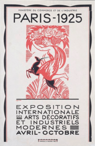
Robert Bonfils. Poster for Exposition Internationale des Arts Decoratifs et Industriels Modernes (1925)
But the Bonfils poster, of which there was a blue version, was but one of several posters commissioned for the Exhibition and all designs for the quartet inhabited an indeterminate in-between zone. The artists had left the pre-war Art Nouveau ethos but seemed to be on a vague path of non-direction with a distinct lack of style. These muddled and muddy efforts showed no trace of the ruling style of the day, Cubism, and carried no memory of the panache of Art Nouveau. Mired somewhere in a long-lost past, these posters utterly failed to indicate the presence of a new way of life that had emerged after the Great War.

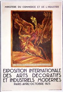
Posters for Exposition Internationale des Arts Decoratifs et Industriels Modernes
by Charles Loupot and Andre Girard and Emile-Antoine Bourdelle
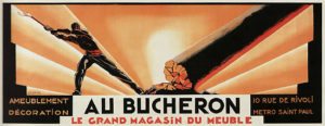
The twenty-two-year-old Cassandre seemed to understand that this new machine built environment was distanced far from the outdated references to nature drawn by Bonfils or the uncertain visions by the other “official” poster artists. Far from being involved with the publicity for the Fair itself, his prize-winning poster, Au Bûcheron, had been designed for the furniture maker, Bûcheron, an establishment still in business today. In the twenties, the furniture store was located on the exclusive rue de Rivoli, an address signifying the high-end nature of its elegant wares. The trademark for Bûcheron, designed by Cassandre, was the lumberjack, wielding his ax and chopping down a thick tree. The natural aspect of a traditional laborer working in the great outdoors implied authenticity, even tradition, but Cassandre canceled out any lingering landscape suggestion with futurist style diagonals darting down towards the stump of the falling tree. The orthogonal wedges encompass the woodcutter and the tilt of the tree, echoing the mechanically straight lines of Art Deco. If there are indications of nature—the folds of the man’s clothing and the grain of the exposed wood—they are subsumed to the striking and forceful design created by Cassandre, who greatly admired Picasso. The Bûcheron delivery truck were all marked with the logo of the woodcutter, instantly recognizable as an updated Art Deco version of Cubism. By the 1920s, Cubism was in the hands of the Salon Cubists and Art Deco Designers who were leading the geometric style to its second post-war life.
As the Au Bûcheron design driving around Paris, elevating his fame, Cassandre made a statement that indicated that he understood the role of graphic design in the streets. He stated, “A Poster is to be viewed on the street. It should integrate architectural groups and enrichen the spreading facades. It should enliven not the individual advertisement board or building, but rather the huge blocks of stone and the vast area as a whole.” The statement is an interesting one, because, for years, the art of wall posters had been neglected by artists. Henri Toulouse-Lautrec was more famous for his posters than for his paintings and his curvilinear designs for the Moulin Rouge cabaret, for example, became instant collector’s items as soon as they were pasted to the wall. The design revolution had moved to the magazine, the book and the questions of graphic design in these small formats. Cassandre’s achievement was to update the public poster, which, unlike those of Toulouse-Lautrec, was moving and needed to be “read” and understood when mobile. As Cassandre explained, “A Poster unlike a painting, is not and is not meant to be, a work easily distinguished by its – manner – a unique specimen conceived to satisfy the demanding tastes of a single more or less enlightened art lover. It is meant to be a mass-produced object existing in thousands of copies like a fountain pen or automobile. Like them, it is designed to answer certain strictly material needs. It must have a commercial function. I need not emphasize that my principal and constant care is to renew myself ceaselessly.”
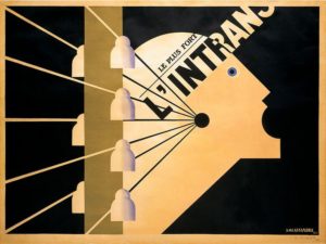
Cassandre knew Paris well. A native of the Ukraine, he had been fortunate enough to have visionary French expatriate parents who sent him to study in Paris when he was only fourteen. He studied art at the stiffly conservative École des Beaux-Arts, where Édouard Manet was a student and then at the Académie Julien where Mary Cassatt attended. One of the ironies of the career of Cassandre was that he drifted into graphic design in order to earn a living, under an assumed name, so that he could also pursue his more serious calling, that of a fine artist, under his real name. The next significant poster designed by the young artist, who was finding unexpected success announcing the new post-war style, was for the newspaper, L’Intransigeant, also in 1925. The shouting profile is that of one of the many newspaper boys who stood on street corners, peddling the latest issue of the newspaper. The open mouth is a pre-radio announcement that newspapers delivered the latest news, the newness and the timeliness of the stories in print is symbolized by the diagonal wires. dangling with white ceramic insulators, flying out of the verticle telephone pole that delivered the messages to the “ear” of the vendor who then opens his mouth and the news pours forth. The direct lines linking message and print and announcement are the stylized lifeblood of any newspaper even today. One is tempted to draw comparisons with Alexandre Rodchenko’s famous photomontage, Books, for the Lengiz Publishing House in 1924. The shouting faces, one female (Rodchenko) and one male or boy from Cassandre, both face the same direction, both use diagonal lines, and one can assume that the French artist was aware of the work of his Russian counterpart. It is also probable that the client, the editor of a right-wing evening newspaper, Léon Bielby, had no idea of the resemblance. Commissioned to design a poster that reflected the ambitions of L’Intransigeant and the words Le Plus Fort–the strongest–emphasize the striking black and ochre design. One can also note that Cassandre effectively reversed the “megaphone” motif of Rodchenko because the wires can be read in reverse–as spinning outward, conveying the latest events in an echo of the open mouth.
The Black and ambers of his color scheme of the early famous posters would prove to be a one-off for Cassandre, who preferred black and blue for his main colors, but the success of his design would set his life course. Cassandre would become one of the most famous designers of the interregnum. And indeed, after his experience with a rolling advertisement, the artist, now an accomplished poster designer, took over the Pi Volo aperitif campaign and made what amounted to a logo for the company that was so successful that it is still a resonant and recognizable sign for aperitif today. The motif of a bird plunging its open beak into a glass of amber drink was inspired by the sound of the “Pi Volo haute.” Cassandre translated the words into sounds and recognized that the brand name could also mean “magpie fly high.” The witty play on words became a witty poster, packed with visual repetition: the bird’s eye with the fixed pupil in the center was echoed as the dotted “i” of the word “pi,” another playful jest. In English, the joke is even more amusing–the “dotted eye (dotted “I”), waiting for the viewer to catch on to the word play. The repetition continued with the shape of the bird itself, a tight U, like the bowl of the glass. The V of “Volo” is the same V as the bird’s beak. The colors of this poster reflect back on the past with the amber glass of wine, but the blues and grays point to the future of the poster designer, now ready to take on another aperitif.

Cassandre refused to follow in his own footsteps, repeating himself and considered the brief from a company that manufactured a “drink,” or something for the young customers who wanted party refreshment, so to speak, as a break from the ochres and ambers that nodded to Cubism. He designed for Dubonnet from a perspective quite different from that of Au Bûcheron but picked up from the new direction of Pi Volo. The new client for the aperitif, Dubonnet, was the concoction of a French chemist, mixed for the French Foreign Legion and its soldiers, who needed to take doses of quinine. Bitter tasting Quinine is still used to combat malaria, and Dubonnet, a heady mix of various herbs and spices and the peels of fruits, masked the quinine. With or without quinine, Dubonnet, a propriety family recipe, is a light drink that is ideal for opening a meal or for leading off an evening. Its advertisements became famous thanks to the talents of Henri-Toulouse Lautrec, who made posters an art form, and Jules Cheret, who made this snappy little drink fashionable. Following in the footsteps of collectible posters, populated by alluring available women, Cassandre interjected humor in the persona of a squared off little man always in profile, always at a table, always enjoying his Dubonnet. Dubonnet was probably as famous for its posters as it was for its beverage, a wine aperitif that would be mixed into the new drink of the Jazz Age, the cocktail.
Following in the footsteps of collectible posters of Toulouse-Lautrec and Cheret who populated their designs with alluring available women, Cassandre interjected humor in the persona of a squared off little man. The serious and sober little man was always shown in profile, always sat at a table, and always enjoying his Dubonnet. Like Magritte’s Everyman, Cassandre’s drinker of Dubonnet also always wears a bowler. In his most engaging poster, the artist created a series of sequential images, functioned as cells in an animated film. In the first scene, the middle-class gentleman, drawn in sharp outline, is sitting his squared-off chair in front of his squared-off table. He raises his glass full of wine and gazes at it. At this stage, the hand and arm holding the drink and the front half of his face and hat are black. Down below, the letters DUBONNET are divided between full and empty. DUBO is black and NNET is empty of color. In the second poster, our man begins to drink, head tilted back, wine pouring down coloring his torso black. An N has also become dark. In the final frame, now totally black, the man is holding the bottle of Dubonnet, pouring himself another drink. He is all black, with only the white of his eye shining brightly as he watches the liquid flowing into a white glass. The emptiness of the white glass is signaled by the empty white edge of the table, but all the letters are black. The background color also shifts from a pale pinkish tint to a lavender shade. At the end of the story, the little man is surrounded by a copper field of orange-gold, but his throat, is white, waiting for the next drink. This distinctive poster illustrating the power of drinking a delicious and refreshing drink is still famous today.
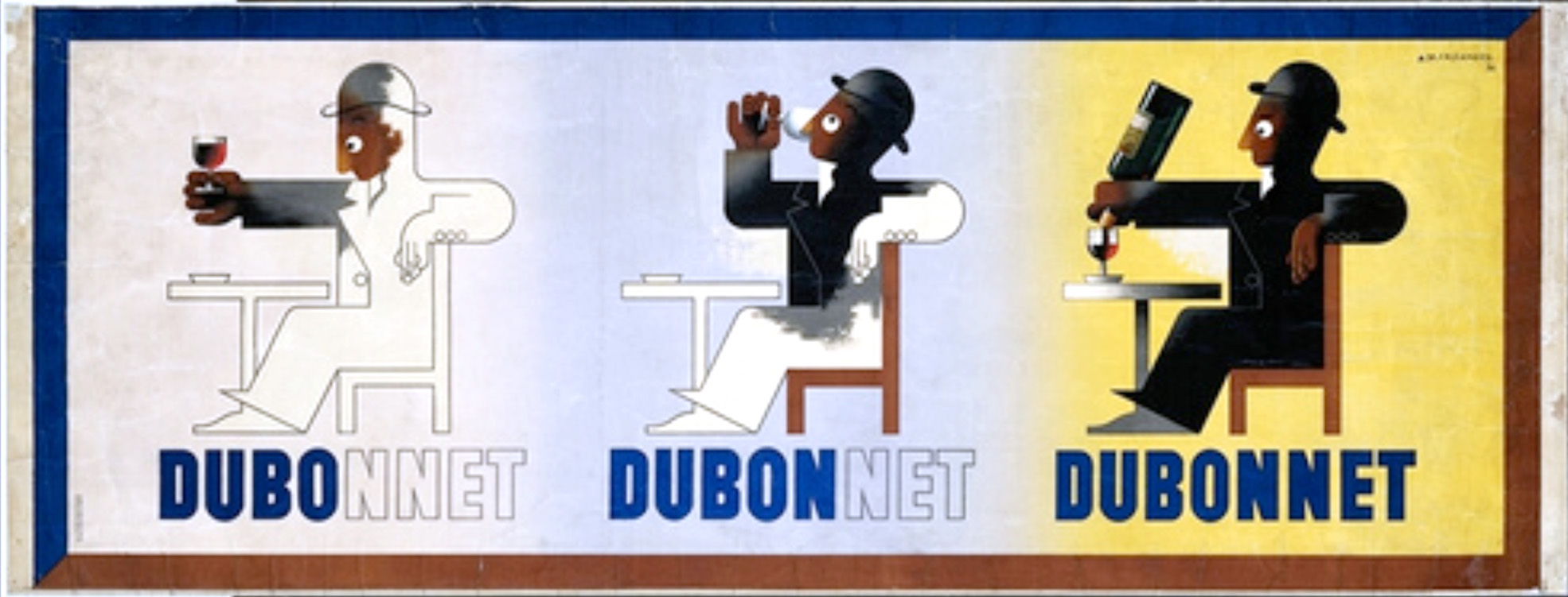
In The Advertising Age Encyclopedia of Advertising, John McDonough and Karen Egolf discuss the way in which the lettering works with the content at some length: “In this poster, the product name, the visual, and the creative use of type interact to communicate the advertiser’s message. In the first panel, an outline illustration of a man poised in anticipation of his first sip of the liquor is only partially filling in, his right arm extended and holding a full glass. Design and typography reinforce each other, as Cassandra has placed the extended arm above the first four letters of the band name. The type starts to tell the story, with the D. U, B and O of the brand name filled in like the character’s arm and the other letters shown in outline type. In the second panel, the man is shown drinking the beverage, with part of the outline at the top filled in. The type beneath now shows the product name with an additional letter in as well, DUBON–suggesting “bon,” French for “good.” In the third panel, the entire outline of the figure (now shown replenishing his glass) is completely filled in as are the letters that spell Dubonnet, suggesting that the imbiber is now fully satisfied.”
Cassandre continued his poster career. The artist who created two posters that eternally advertise aperitifs, almost a century later, went on to characterize luxury travel available to the fortunate few in tje dark years of the 1930s. The next post will discuss the railway and shipping posters that still make us want to travel. If you have found this material useful, please give credit to Dr. Jeanne S. M. Willette and Art History Unstuffed. Thank you.