History of French Fonts, Part Two
Cassandre and the Fonts of Art Déco
A. M. Cassandre, as the artist sometimes signed himself, was also known more simply as “Cassandre.” Adolphe Jean-Marie Mouron (1901-1968) burst on the Parisian scene as Cassandre with a prize-winning poster design for the Bûcheron furniture company. As can be seen by the lettering in this work, Cassandre’s career as a poster designer would be pivotal for his dual career as a font designer. Although the Bûcheron poster was influenced by Cubism and Futurism, the font he modified for the lettering was an ancient one, known as Capitalis quadrata. Capitalis quadrata was also known as capitalis elegans. Capitalis quadrata was a Carolingian (medieval French) revival of inscriptions carved in stone during the Roman Empire. The script may have been suitable for carving but writing it by hand was an awkward experience. Therefore Medieval scribes saved this difficult quill manipulation for titles and, laboriously, for coping Latin inscriptions. The Carolingian Empire under Charlemagne was a revival of the Roman Empire and the difficult font was selected deliberately and deployed semiotically to evoke past glories.
Not only was capitalis elegans in the French bloodstream, it was also not as antique as it might seem, as this font is the ancestor for today’s square capitals. However, it must be admitted that the use of an ancient Roman font for a very modern poster was perhaps too hybrid for the modern era. After this excursion into thick letters inspired by the past, Cassandre confined himself to the more modern and sleek sans serif styles. Trained as an artist, it is clear that Cassandre brought an artist’s mind to the problem of modern design. But he also designed with a strict eye to mathematics and proportion. Every element of each poster was determined by an underlying “grid” of proportions, invisible to the eye of the intended audience but visible in the organization that made his layouts so effective. A Russian émigré, Cassandre seemed to be able to move easily among a number of artistic circles, which, no doubt, enabled him to remain inspired and open to new ideas.
According to the Rochester Institute of Technology,
Cassandre moved among the circles of the 1920s Parisian Avant-Garde which included the symbolist composer Eric Satie (1866-1925), the absurdist writer Apollinaire (1880-1918), and the Cubist painter Fernand Léger (1881-1955). Following the Art Deco premiere at the 1925 Exposition, Cassandre joined with designer Jean Carlu (1900-1997) to form a group of artists whose mission would be to advance Modernist aesthetics in all applications of design and thought. The Union des Artistes Modernes (UAM) was born of this common goal. Charles Peignot, joined the group’s membership with the likes of writer Jean Cocteau (1887-1963), Nobel laureate André Gide (1869-1951), architect Le Corbusier (1887-1965), decorator Sonia Delaunay (1885-1979), Maximilien Vox, and other artists who specialized in the design of jewelry, textiles, furniture, and lighting. Peignot later clarified the group’s purpose: “Together we tried to break away from the style that survived the first World War. It is not surprising that I tried to accomplish in my field what my friends were doing in theirs.”
Charles Peignot (1897-1983) was the artistic head and aesthetic guiding spirit behind the venerable French typefoundry Deberny et Peignot and was in search of artists who would join him in bringing the ossified field of designing fonts back to life. The three collaborators, Peignot, Vox, and Cassandre, produced Les Divertissements Typographiques, a publication designed by Vox to show off the new fonts designed by himself and Cassandre to potential buyers and publishers. The next unexpected juxtaposition famous artists occurred in 1929, when Charles Peignot acquired the rights to the Sans Serif typeface, “Futura,” designed by the German artist, Paul Renner (Renner will be discussed in the next post). The Futura font was a favorite of Vox, who asked Peignot to purchase it. Peignot was not particularly interested in the font, but debuted the character in 1931 under a new name, “Europe,” to give Futura a more international and less German origin. As Peignot said, “As to type fonts, a new internationalization is taking place.” The same year he acquired Futura, Peignot issued a new font he much preferred, the Bifur by Cassandre. Cassandre, an experienced poster designer, understood the importance of letters–not words, but the letters or fonts that composed the words–to the overall design. The words had to convey more than information, they had to convey the concept of the idea of the overall design and its message. For example, in the famous series of posters he did for Dubonnet, the letters of the brand name go from empty to full, just like the “little man” he depicted. The little man filled with color as he drank, a metaphor for the satisfaction one derives from drinking Dubonnet.

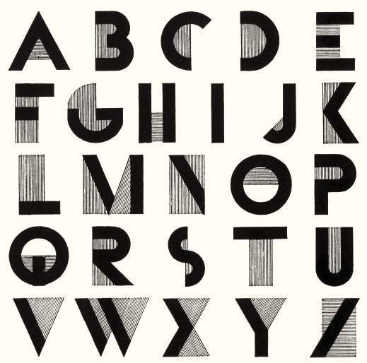
The play between the lettering evolving from outlines to fully filled in shapes in the Dubonnet posters was part of Cassandre’s other trademark for the Jazz Age, his Bifur typeface. The Bifur is a witty exploration of the expanding shapes of the alphabet letters being filled in. The empty spaces in between the lines, the negative shapes, like the interior space of the D, were being emphasized through a series of “curtain lines” in the guise of straight marks that modestly cover the openness. The significance of Bifur is, of course, its evocation of the Jazz Age, but conceptually, the font is quite brilliant. An artist–not a calligrapher, not a font designer–was at work. Cassandre worked with an idea, a concept, seeing the sans serif alphabet in a new way, as a series of spaces caused by a series of lines. In other words, he saw the letters in terms of figures breaking the purity of the plain ground. Once the line or the mark is placed on a plane, then space is created in the mind of the viewer. However, readers had been conditioned to “see” letters as flat objects, of little importance in themselves, existing only as elements that form words that needed to be read. Therefore the words are looked at, viewed, while the individual letters were visually glossed over. What Cassandre achieved was to activate, not just the characters but also the spaces between the lines that were integral to the making of each shape. As Stephen Eskilson wrote in his book, Graphic Design: A New History, Second Edition, “Type such as Bifur are conceptually tied to Cassandre’s poster aesthetic, inasmuch as it uses strikingly stylized shapes in order to grab the viewer in the blink of an eye. Broadly speaking, most Ar Deco types are so easily associated with the look of this era they did not develop longstanding or universal appeal.” However, one could argue that the main interest of the Bifur is not its Art Deco designation but its visual play between “dressed and undressed,” “finished and unfinished,” and other clever binaries.

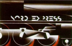
This 1929 font can be seen his Nord Express posters in which the interiors are whisked away by the speed of the train which carried away the delicate lines, leaving the solid forms behind, legible to those who understood the new Art Deco font designed by Cassandre. In the poster, the nascent possibility that letters could travel was activated by the artist who was always thinking of new ways to use a straight line.

Cassandre occasionally wrote of his creations, explaining his concepts but always in a rather elliptical fashion, careful to not give away his design secrets. The essay he wrote on the Bifur font was a case in point. Published in the Arts et métiers graphiques when the lettering was unveiled, Cassandre’s essay tended towards to poetic:
Bifur is a word, a single word. But a star word. It enters a page like a leading ballerina sweeping into the radiance of a spotlight while the other dancers sink into the background on either side. Bifur was not designed by a freakish imagination ; on the contrary, I worked out a precise problem and then endeavoured to resolve it while staying strictly within the bounds of typography. I want to stress the fact that Bifur is not an ornamental letter. Bifur was conceived in the same spirit as a vacuum cleaner or an internal combustion engine. It is meant to answer a specific need, not to be decorative. It is this functional character that makes it suitable for use in our contemporary world. Initially, a letter is a pure form, but it is gradually distorted by the woodblock carver’s chisel, the scribe’s alcoholic pen, the etcher’s needle used by the first punch-cutters who delighted in imitating the pen. I have tried to restore to the letter that which originally belonged to it, and to it alone. Therefore, it Bifur looks unfamiliar and strange, it is not because I have dressed it up eccentrically but because, in the midst of a fully clothed crowd, it is naked. I have simply tried to revive the word’s original power as an image. Reduced to its barest expression, its simplest form, the word becomes more “photogenic” to our tired retinas, I believe. DANGER. Bifur was designed to function like a railroad signal-a peremptory stop sign. If by accident it does not function as it should–if it is mishandled, say, by an inexperienced typographer-disaster is inevitable. Bifur was designed for advertising. It was designed for a word, a single word, a poster word. As Blaise Cendars once said in reply to a questionnaire on advertising, “I wish that you would find–you who are today calling on writers-a spontaneous poetic genius who will come up with a simple, gigantic word that can take its place above Paris along with the gigantic Bébé Cadum poster.” Bifur was cast to print that word.
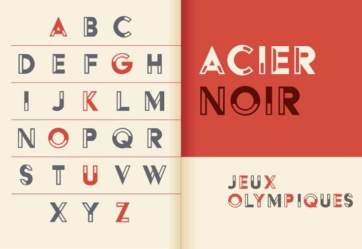
Acier of 1930 and Acier Noir, the font of 1935, also played with the half full and half empty theme, where each letter was fully formed but its lines were either left as outlines or its contours were filled in. Cassandre used color to fill in the empty shapes or the negative space that lay within each letter, activating unused possibilities.

But the most familiar font is the “Peignot,” designed by Cassandre, and is the most identifiably Art Deco font of all. The delight of Peignot, his most popular font, is its indulgences in the occasional curved line and the gently rounded edges that replace the sharp elbows of his early fonts. Most distinctive are the font’s sudden extensions, swooping off at the will of the artist-writer and the combination of the two cases, upper and lower in the same word, again at the whim of the designer. In creating new typefaces or fonts, Cassandre was part of the post-war urge to create a style of lettering that expressed what it meant to be modern. Is important to stress once again that Peignot was designed for the Deberny et Peignot foundry, which was dedicated to keeping pace with changing times. In addition, the work Cassandre did for the firm was aimed or targeted, not so much at book publishers but more often to advertisers looking for a distinctive font.

The post-war printers were very competitive and sought to develop their own unique signature fonts to attract customers. Creating a new font was not a task to be undertaken lightly. In a highly complex craft, largely lost today, a “punch” or the outline of the letter in steel was carved out and was then transferred to a copper matrice, an hours-long painstaking process done by only a few skilled professionals. The individual letters, capitals and lower case as desired, done in multiples, which are reusable for years. One can witness the arbitrariness and adventuresome nature of Peignot in which the capitals and lowers cases can appear at will within the same word. The 1920s were a golden age of experimenting with fonts and creating a modern design, suitable for the post-war period. With the invention of the distinctive typeface that became the visual signof the Jazz Age, Cassandre was one of the more successful of the Art Deco designers in that his work was probably circulated the most within popular culture. His covers for Harper’s Bazaar will be discussed in a later post, but his Surrealist designs for the late 1930s defined the decade before the Second World War just as strongly as his work in the twenties characterized Les Années Folles.

In France, the invention and creation of new fonts for advertising and design were for the purpose of branding products and, therefore, of suggested a specific lifestyle. In the case of the Peignot font, the target reader was assumed to be sophisticated and knowledgable of all things fashion. This extremely moderne lettering appealed to an elegant upper crust, who needed to be tempted to purchase the latest luxury goods. It was Cassandre, who designed the still-used and very famous logo for Yves Saint-Laurent in 1961. In contrast to the merchandising role for fonts in France, in Germany, the font was fraught with political peril as will be discussed in the next post.
If you have found this material useful, please give credit to
Dr. Jeanne S. M. Willette and Art History Unstuffed.
Thank you.