History of French Fonts, Part One
Cassandre and Deberny et Peignot
When an artist heaped with honors in his lifetime, including the being promoted an officer of the French Legion of Honor, ends his career with suicide that is a terrible tragedy and a great loss to the art world. But before the inexplicable end, this artist was the famed author of the visual culture of the post-war period. Born to French parents in the Ukraine, Adolphe Jean-Marie Mouron (1901-1968) shunted back and forth between France and Russia, until in 1915, the family moved to Paris permanently, thus missing the upheavals of the Russian Revolution. The young artist attended the local art academies in Paris, moved to Montparnasse in the 1920s, but did not take the expected path towards fine art. Instead, Mouron gravitated to a new and emerging field–modern graphic design, making his bones first as a prize-winning poster designer. In these early years, he adopted the pseudonym of “Cassandre,” which appeared from time to time with his last name or as “A. M. Cassandre.” Eventually, as he became famous, Mouron became the one the only and uniquely “Cassandre.” The artist first gained fame when he designed an orange-gold and black poster for a furniture company, Bûcheron, (the poster designs of Cassandre will be discussed in a later post), radiating diagonal lines that seemed to announce not just chairs, tables and bureaus but also the arrival of a new era of geometric shapes. Prominently displayed in Paris, this obvious and striking example of modern design won first prize at the Exposition Internationale des Arts Décoratifs of 1925. The poster and the prize it won caught the attention of Charles Peignot, the head of one of France’s oldest and most innovative typefoundry, Deberny et Peignot, a new combination of two firms, which had just merged in 1923. Under the guidance of the artistically minded leader, Peignot, the role of the foundry expanded from manufacture to font design. Cassandre was invited to join Peignot and one of the other new designers, Maximillien Vox (Samuel Monod) (1894-1974), in the task of creating modern typefaces suitable for the modern machine age.
In his book, Modern Typography. An Essay in Critical History, Robin Kinross wrote, referring to the “black art,” or typography, “One might argue, with this distinction in mind, that ‘modern typography’ is indeed a duplication of sense because when printing becomes typography is also when printing becomes modern. Printing becomes modern with the spreading of knowledge about itself: with the published description of its practices; with the classification of its materials and processes; with co-ordination of dimensions of materials, enabling their exchange and better conjunction; with the establishment of a record of its history.” He continued with a discussion of the beginning of modern type or the beginning of sans serif. “Sanserif, as a printing type, made its first appearance in a specimen of 1816 (of William Caslon IV), though it became established as a recognized style of type only in the 1830s in England..” Matthew Carter commented in Eye Magazine on the contribution Kinross made to an understanding of the importance of printing, fonts, characters to modernity, “Robin Kinross dates modernity – implicit in the very idea of printing – as an explicit attitude that began in about 1700, when printing began to be used as the means to describe itself. Here, ‘printing’ is the practice, ‘typography’ the ordering of that practice by instruction, and in the manuals of Moxon (1683-84) and Fertel (1723) typography became articulate and therefore modern.” In other words, Kinross asserted in 1992, a certain self-consciousness about information and how it is dispersed begins to stir. In 1683, Joseph Muxton published, Mechanick Exercises on the Whole Art of Printing, which not only wrote done a tradition passed down orally, he also wrote what would become a handbook for printers for the next two hundred years. In in the mid-seventeenth-century, the typographer began to separate himself from a “printer,” such as Joseph Muxon and became more aware of design. But the marriage of typography and design, or perhaps more precisely, the transformation of typography into design came in the late nineteenth century. “The familiar account, which I think has much truth in it, is that out of the Arts & Crafts rebellion emerged the figure that we call the designer—the typographic designer, the book designer. This person attempted to order the processes of production in printing and attempted to reinfuse the aesthetic element, the dimension of material and visual surplus—pleasure—which printers could no longer provide as an inbuilt part of what they were printing,” Kinross wrote.
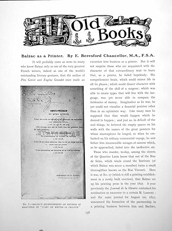
Kinross focused primarily on British printing, but some of the most distinctive fonts that emerged from the modern period came from France. It is possible to argue that although English artists precipitated the shift into typography as an art form, it was the French and the Germans who took the next step. Leading the way in France was the firm of Deberny et Peignot. The history of Deberny et Peignot was an interesting one, starting unexpectedly with the famous author Honoré de Balzac (1799-1850). Balzac paused, at the beginning of his writing career and became a businessman before he became a famous writer. According to B. R. Tolley’s article “Balzac the Printer,” in a 1959 issue of French Studies, from 1825 to 1828, he was a publisher, a printer, and a typefounder. As Tolley wrote,”Balzac used his commercial experience and technical knowledge in his novels.” The detour into publishing seems an odd one for Balzac, but he was an author who saw the opportunity to turn this field to his advantage. Balzac had experienced some success as a writer in the early nineteenth century, and, indeed, his definition of “success” was to become rich by churning out books rich with entertaining soap opera. Balzac admired Sir Walter Scott, who had turned the writing of historical novels into a lucrative business. Balzac, however, as an observer of the “human comedy,” and was more interested in observing the contemporary age and was one of the literary pioneers in the new genre of “realism,” meaning the recording of modern life. In The Politics of Style in the Fiction of Balzac, Beckett and Cortáza by M. R. Axelrod, the author noted that “Balzac’s approach to Realism, like his mentor, made a business out of literature. In his own way, he was the ultimate bourgeois writer..” Indeed, when he hadn’t become famous by the time he was twenty-six, Balzac ventured into the printing business, convinced as Alexrod put it, that “his fortune would be made and leave him plenty of time for writing.” Using money borrowed from his mistress, Louise-Antoinette-Laure De Berny, and his mother, Balzac partnered with André Barbier, a typesetter. The publishing venture, located on the Rue de Marais-Saint-Germain in Paris was to publish the works of La Fontaine and Molière, not to mention those of the struggling author, failed, and Balzac was advised to make money to cover his debts by purchasing a printing press, a financial move that only put him deeper in debt.
The Imprimerie H. Balzac was willing to publish anything and, like a true capitalist, the author purchased the typefoundry of Jean-François Laurent to establish control over all aspects of his enterprise. Alexrod wrote, “Becoming a printer in order to save his publishing, he finally became a type-founder in order to save his printing, by purchasing a bankrupt type-foundry.” But none of those businesses succeeded, mainly because Balzac spent all the profits on his mistresses, plural. His partner, Barbier, abandoned the failing enterprise, leaving the writer with the consequences of his own bad management and bad judgment. Balzac concluded his ill-fated business career over 100,000 francs in arrears, and the author refused to descend into a bourgeois fate of declaring bankruptcy. Fortunately, in 1828, he was able to turn his debts over to his mistress and to foundry owner, Laurent. The nineteen-year-old son of the aristocratic Louise-Antoinette-Laure, Alexandre de Berny, became the new partner and, not wanting to mix nobility with business, renamed himself “Deberny.” As any reader of Balzac understands, the author’s ignominious experience as a failed printer and bankrupt businessman became materials for his mature works. But during his checkered career in publishing, Balzac printed some 168 pamphlets, newspapers, and books, and some sources say this number was as high as three hundred.
An early article on Balzac as a Printer
Four decades later, in the waning years of the Second Empire, Gustave Peignot (1839-1899) acquired a foundry with the idea of manufacturing fonts or letters. For decades Peignot systematically acquired other foundries (and their font collections), building a business large enough and solvent enough to support the father and his five sons, including Georges Peignot (1872-1915). Georges made all the “aesthetic” decisions, from the artistic selection of fonts to business moves that guided the firm in the direction of innovation. One of the most important decisions he made was to not only acquire already existing typefaces from other firms but to also create new fonts. Starting with emerging style, Art Nouveau, he hired the Swiss architect, artist, and designer, Eugène Samuel Grasset (1845-1917). Today Grasset is best known as a designer in stained glass and is famous for his distinctive Art Nouveau posters, especially in America. In fact, although he is almost forgotten today, Grassat was an extraordinarily versatile artist, a well-known furniture designer for Charles Gillot and the decorator of the famous Chat Noir cabaret. His fame would have been a magnet to the twenty-five-year-old and ambitious Peignot, who approached the artist and informed him of his ambition to update the moribund business of typography. In fact, he told the startled artist, he wanted nothing less than a revolution that would separate France readers from the old and outmoded Didot and Garamond fonts. He wanted an Art Nouveau font. The artist himself had already attempted to get his own font engraved but no foundry was interested. When he saw Grassat’s drawings, Peignot was impressed with the rejected Art Nouveau font and incorporated the “Grasset” font in 1898 into the family business. The “Grasset” font was based on an old font, dating back to 1471, the alphabet of Nicolas Jenson. The foundry offered the new font in thirteen sizes and based the letters directly on the work–the drawings–made by the artist. The Grassat font was introduced at the Universal Exhibition of 1900 in Paris, the event that introduced the new style of Art Nouveau to the public. The contemporary Art Nouveau version was an immediate success and the striking design foregrounded a nearly forgotten art form, the creation of fonts.

1940’s French type foundry drawer from a Deberny Et Peignot typesetter’s chest
Georges Peignot was very important to the history of modern French fonts because he recognized the need to update letters and understood that characters needed to express their own time. The other field of visual culture Peignot opened was the culture of name recognition through typography. The Art Nouveau fonts he sponsored, such as those of Georges Auriol (1863-1938), whose “Auriol” font was used ten years later for the Paris Métro, became distinctive typefaces, which “branded” certain experiences. To walk under the distinctive Hector Guimard Métro entrances was to commit to using a new form of transportation that needed to be announced by a distinctive look. The Métro used the most modern font available and the Piegnot fonts became the visual metaphor for Art Nouveau. These Art Nouveau fonts were highly specialized and worked best in selective venues. For example, the fonts of Grasset or Auriol were used only for certain kinds of decorative or “fantasy” books. For serious printed works, only the historic Garamond and Didot (acquired in 1912 by Peignot) fonts were appropriate. Peignot continued to commission artists to create new fonts until his death in 1915 in the Great War. Four out of the five Peignot brothers died in this conflict, leaving behind the memory of the important foundry, honored in Paris in the Rue Quatre Frères Peignot and a surviving young brother.
Like his father, Charles Peignot (1897-1983), the only heir, was artistic and left the business end of the foundry to those better suited to running a manufacturing establishment. In the early twenties, the main competitor for the Peignot company was the old business of Balzac, Deberny, and the two firms understood that it would be more profitable to combine forces. In 1923, Deberny et Peignot came together, combining Deberny’s traditional fonts and the modern fonts of Peignot into one enterprise with Charles Peignot as the artistic head of the new firm. Peignot began an eight-year partnership with Maximillian Vox in 1924, promising to work with the artist to actualize Vox’s “typographic conceptions.” Vox speculated, “It is not impossible that France, with its innate sense of proportion, will see the birth of 20th-century type.” Referring to the history of the role Deberny et Peignot played in revolutionizing fonts, the designer also paid tribute to Georges Peignot, stating that he was “the first French typographer who did not think of his job as confined to supplying the printer with little pieces of metal.” When the Exposition des Arts Décoratifs et Industriels Modernes opened in Paris in 1925, it was clear to Peignot that the day of Art Nouveau had passed and the machine age called for a sharp and clean line of modern fonts, to rectify the excesses of Art Nouveau. It was at this point that the printer made contact with Cassandre and asked for an Art Deco font. And so the long winding road brought Balzac and Cassandre together in an improbable association in the firm Deberny et Peignot.
In the next post, the modern fonts of Cassandre will be discussed.
If you have found this material useful, please give credit to
Dr. Jeanne S. M. Willette and Art History Unstuffed.
Thank you.