Walter Dorwin Teague (1883-1960)
From Art Deco to Streamline
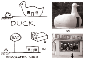
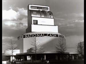
It is now time to speak of Bluebirds and Bantams and the occasional Marmon, with the inclusion of the late arrivals, Pringles, all of which were designed by Walter Teague. Teague brought us the modern gas station, providing the architect of the 1960s, Robert Venturi, with a quintessential example of a “decorated shed.” The concept of a shed with decoration can be best understood by comparing this basic building with its counterpart, “the duck,” which is what it looks like. So to speak..The famous cash register on the top of the National Cash Register Building at the New York World’s Fair of 1939 was the clever idea of Teague who used the cash register itself to add up, to total the day’s attendance. This kind of building was an example of what Venturi once termed a “duck,” a building that looked like what it said it was, in that case, The Big Duck establishment where one could buy duck eggs and, If one wanted to, a duck as well.
One could argue that placing a large replica of a cash register on top of a building is less of a design than a sight gag and a gimmick but the world’s fair was a “fair” after all and an important designer such as Teague could show off a bit. After all, Walter Teague had designed the distinctive gas station for the mid-twentieth century. And the gas station was a shed, that is an oblong box with a distinctive roof and a logo, i.e. a decorated shed.
Today we tend to take the gas station for granted and indeed, during the first two decades of the twentieth century, road architecture began to develop distinctive forms, shapes that could be recognized from afar, beckoning the hungry and tired traveler. People were driving long distances and needed food, gas, and accommodations and they would scan the horizons, seeking buildings with the forms that defined their function. Motels, motor hotels for travelers, and camps began to appear along well-traveled highways and soon acquired an accepted an common arrangement still seen today: a horizontal string of free-standing cabins or connected rooms. The idea was to allow the motorist to recognize the distinctive appearance–a “duck” if you will–to avoid confusion between a boarding house and a motel. Roadside restaurants would evolve more slowly but would have to advertise their function and be visible from a distance. Early gas stations evolved out of storefronts, houses, barns and so on and were distinguished by nothing more than the presence of pumps, which were themselves undistinguished. Gas pumps, which were simply water tanks filled with gas, could be placed anywhere there was enough space for storing gas and lined the sidewalks along with street lamps and fire hydrants. However, Walter Teague would bring order to the muddle of early gas stations by designing a distinctive building for a very old oil company, Texaco.

Founded as the Texas Fuel Company in 1902 and becoming Texaco the following year, this company was the first in 1928 to sell gasoline in all forty-eight states. The red star in the center of the circle referred to the lone star state as did the “T” overlapping the star, and this instantly recognizable logo rose like a brazen flower above the landscape on a tall stalk, marking the site of service and gas. According to Daniel Vieyra’s book Fill ‘er Up: An Architectural History of America’s Gas Stations, the gas station “is undoubtedly the most widespread type of commercial building in America.” By the mid-thirties, the gas station had evolved into one-stop destination where one could purchase replacement tires, obtain car repairs, and buy supplies from oil to gasoline. A fully functional gas station would include a waiting room for customers, a restroom and might even provide snacks for those waiting for their cars to be washed and this complex business with repair bays would be called a “service station.”
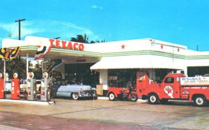
As the book The Gas Station in America by John A. Jakle and Keith A. Sculle explains, the expansion of an ordinary building from a place to buy gas to a specialized structure for a variety of related services was a phenomenon of the Depression. As was pointed out in earlier posts, the Depression marks the beginnings of the modern consumer culture as businesses used advertising and branding to identify themselves in an effort to urge the customer to buy. “The economic depression of the 1930s brought many changes to gasoline station design. To counter deteriorating gasoline sales, many companies expanded auxiliary product lines requiring larger display rooms and larger storage spaces. The sale of tires, batteries, and accessories..was universally adopted by the major firms. At the same time, companies began to emphasize automobile repair, which required more and larger bays. In addition, the Depression encouraged a few companies to expand territorially since construction of new stations in new areas did not divert customers from a company’s established outlets but could attract trade from one’s competitors. To develop these new territories, the oil companies build stations that were distinctly different. Most companies also used new stations that were distinctly different. Most companies also used new stations to reinforce territorial cores in the drive to increase gallonage and market penetration. HIp and gable roofs were replaced by flat roofs. Offices were enlarged and integrated into service bays. The whole was integrated as an ‘oblong box’ with rectangular perimeter dimensions. The amount of plate glass was increased with a corresponding reduction in exterior decoration. Walls of stucco or brick were painted using colors appropriate to a company’s signage. Terra cotta was a popular facing material in the 1930s while porcelain enamel dominated in the 1940s and 1950s. This new gasoline station design followed loosely the edicts of the new “International” style of architecture championed by the Bauhaus school in Germany. Marketing engineers called their architect-designers took pride in introducing streamlined, modern stations. ‘Modern architecture,’ however, was certainly a misnomer. More correctly, they had introduced ‘Depression architecture,’ a stripped-down, functional design to put a new optimistic face on hard economic times. Several of the nation’s leading industrial designers were challenged with raising gasoline station architecture to a higher plane. Industrial design was a newly emergent profession charged by American manufacturers with configuring products with maximum sales appeal. Walter Teague, hired by Texaco in 1934, created a new look for the company: white streamlined boxes that were thought to give the impression of speed, modernity, and progress. Some 10,000 of these stations were ultimately constructed.”
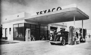
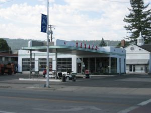
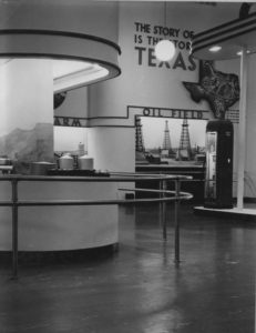
Teague designed the prototypical gas station, a design that would become standard for other companies other than Texaco which modified his basic white box. As Vieyra noted, the gas station designed by Walter Teague was without style or theme and dedicated to being functional. Following the example of Standard Oil and Shell, companies that marked their gas trucks and station signs with the distinctive logo, Texaco sought to make its gas trucks and service stations instantly recognizable to the motorist. In Stories in Stone: Travels Through Urban Geology, David B. Williams described Teague’s design for Texaco as the “classic.” The white box was “clad in enamel, with three parallel green stripes wrapping around the building, clearly labeled service bays, a glass-enclosed office, and indoor restrooms..” He continued, “..the Teague box was streamlined, orderly, and incredibly successful.” By 1936, in time for the Texas Centennial which would take place in Dallas, Texaco had called upon Walter Teague, who also an excellent designer of exhibitions. He introduced the new name and the new logo and the new look at a pavilion at the Centennial which he discussed in his article “Exhibition Technique” in American Architect and Architecture published September 1937. The Texaco exhibition was designed to move the spectator through the various segments staged along a curvilinear path which resembled the interior of a very clean, very white, and very streamlined gas station. As Teague wrote, “The Texaco Building at the Texas Centennial in Dallas is an excellent example of planning for dramatic display and controlled traffic flow.” His intention was, as he explained was to organize the experience: “A continuous and unified story cannot be told unless you are able to present your story to your public in a logical order..”
Garland Pollard wrote in 2010 that “Teague took something supposedly dirty and messy, a service station, and turned it into the white, sparkling image of a hospital..The Teague Texaco station design was simple and could be configured in a number of ways depending on the space available. In all versions, the outside was white, porcelain-clad metal, which defined rust and sparkled with only a quick wash. The inside of the station was completely visible to outsiders, with glass auto bays and a large glass window on the front..The ability for drivers and passes by to see inside of the station conveyed a strong message that Texaco dealers knew cars.” Pollard’s point was well-taken. The idea of a “hospital” and a knowledge of cars would give the motorist a feeling of well being, but the design of the building itself also resembled a factory, the icon of industrialization. Tucked underneath the outstretched portico which protected automobiles and pumps from inclement weather was the glazed and curved façade seen in the Fagus Factory of Walter Gropius and Adolf Meyer.
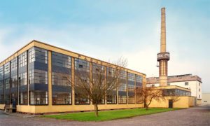
Undoubtedly, Teague was totally aware of Gropius and the Bauhaus design for mass-manufactured products and his evocation of the German architect, while it was probably lost on the customers, elevated the Texaco stations from the past and placed it into the progressive future. At a time when the flat roof–as discussed in a previous post on the Bauhaus–was a controversial topic in Germany, the white box of Texaco slipped seamlessly into the American vernacular. The green stripes, suggesting speed, contrasted sharply with the red star, but these strong colors were absorbed into the stark white and glittering glass of the building. The red pumps stood proudly as almost organic counterpoints to the insistent modernism of Walter Teague’s service station that would announce to the nation that a new way of life, based on mobility and movement had arrived. Like the other high style products designed by Teague during the Depression, the Texaco service stations belied the depressing fact that many Americans could not afford to purchase a car, much less buy gas. But the point of these stations was to make a social statement but to elide the national crisis and to encourage those who could to spend, consume, and travel.
Like the other high style products designed by Teague during the Depression, the Texaco service stations belied the depressing fact that many Americans could not afford to purchase a car, much less buy gas. But the point of these stations was to make a social statement but to elide the national crisis and to encourage those who could to spend, consume, and travel. The most important element of Teague’s Texaco station was their utopian nature and the promise that the personnel inside, working away on cars in need of repairs were the technologiests of the future. The flat roof, the low long lines of the building, the successive stations implying progress from one state to the next instilled confidence in progress and in the American ability to carry on and move forward no matter how bad the times and how uncertain the journey. The next post on Teague will discuss his equally futuristic consumer goods.