Walter Teague and the Radio
Technology as Furniture
In 1936, designer Walter Teague discussed “Industrial Art and Its Future” at New York University in relation to the upcoming New York World’s Fair, saying that although the fair would be a large exhibition of objects made by the industries in America that the spectator should be aware that a higher purpose would be revealed. The Fair was to be more than a display of “wares,” in fact, Teague insisted, “The merchandise on display, whether good or bad, will also be works of art..As are the streets in which these factories stand, the other buildings that line these streets, and the vehicles that fill the streets and thru furnishings and appliances in the buildings–all are works of art.” Teague was optimistic that the Fair would teach the visitors that the products that would be on view had the same artistic value as works of art in museums. On one level, he was making a case for the artistry of industrial design, a relatively new field, and on the level of examining the field itself, Teague was pointing out to the audience that designers were using new technology in conjunction with a determination to make a work of art out of, say, a toaster. Or for that matter the humble radio. Looking back on his address in New York, Teague’s discussion of design as art was prophetic for it could be argued that the Thirties was a golden age of design, propelled by the unifying design aesthetic–Streamline–of the time that brought a wide range of products under the same visual vocabulary. This vocabulary or language if you will of Art Deco or Streamline was deliberate and self-conscious and applied to everything from a train to an iron, knitting far-flung objects into the same state of mind: that the ordinary could become extraordinary through design.
This desire to create beauty through products-as-art as evidenced by the designers of the Depression period was, of course, linked to the urgent need to get people to consume, to spend money, to purchase newly minted products. But the demands of capitalism also supported the vision of the designer who, with a freedom of expression that can exist only during a time of danger and necessity, was allowed to reach out to the ordinary buyer and to offer him or her an object of genuine desire. Consider the one object that no household of the 1930s could not do without: the radio. Let it be briefly stated that the radio was lavished with the attention of all of the famous designers of the decade and the result was that these radios are collectors’ items today, such is their beauty and artistry. If this statement sounds like an exaggeration, compare the simplest radio with today’s televisions sets. Like their ancestor, the radio, televisions sets are the focal point in many homes today and yet they all lack any sense of design. Indeed they are simply screens in a plan frames, placed on an equally uninteresting foot or base. All are black and there are no choices in colors or finishes, and in comparison to the elegant radios of bygone days, the television set of the twenty-first century is a sad and depressing object. Compare the television set with Walter Teague’s masterpiece of radio design: the large and impressive Nocturne Radio, Model 1186.
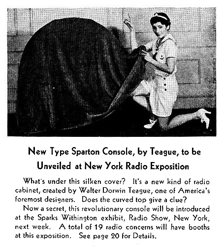
As Teague himself asserted, “We are not building big and little gadgets–we are building an environment.” While the television set of today has been downgraded from the large piece of furniture it once was, the radios of the thirties ranged in sizes from a full-scale spectacular design, created for fashionable and elegant living rooms. The Nocturne was described, breathlessly, by the company Sparton as “The Style Sensation of the Radio World” was revealed at the New York Radio Exposition in the fall of 1935. Teague created four designs that would be on sale by 1936 and the Nocturne was the largest and cost close to four hundred dollars, a sizable sum for those days. Initially hidden behind a “silken cover,” the four-foot high model was perhaps too big for the average living room–hence the smaller models–but it would have graced a mezzanine of a hotel very impressively.
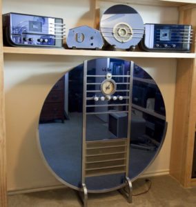
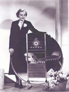
Although Sparton produced this line of radios in rose, the Peachbird, as well as blue, the blue models were by far the most popular and included the 557 “Sled” on the right and the 566 “Bluebird” second from the right and in 1937 the 558 “Sled” on the left and the oddly shaped 409-GL was the last of its line, released in 1938. The Nocturne was simple in materials and construction: the casing for the radio was a humble plywood box the height of the mirrored front, holding twelve tubes at the top level and a speaker at the bottom level. The flat disc itself was deep blue glass crossed with horizontal stripes enclosed in a vertical frame to demark the controls and to outline the speaker. Advertised as “A vision in Midnight Blue Crystal Mirror Glass and Satin Chrome,” the details of the model include a mirror which is “is 42″ in diameter. While it appears to be a large round mirror it is actually 4 separate mirrors, the 2 sides, above the speaker and below the speaker held together by the cabinet and the chrome frame. The mirror itself was backed with black felt and the mirror color comes from the Cobalt Blue glass with standard mirror silvering. The Cobalt Blue glass is what makes it nearly impossible to replicate these mirrors today.” Sadly, this magnificent machine did not sell well at the time, possibly because the design was far too sophisticated for its time.
But these blue mirrored radios, in all their blue glory, fulfilled a quest on the part of Teague who said, “I believe we are acquiring a realization of this unity of all artistic effort..The importance of such a realization cannot be overestimated; for it means that the great body of our work, so long free from any aesthetic rule and bound by no standards of conscience or taste, will slowly be subjected to the same critical control which was formerly restricted to a few highly specialized forms of art.” He continued, “We are coming to appreciate beauty as a revelation of problems rightly solved, a sign of success, a proof of value, a visible rightness.” In the case of radio design, Teague was entering into a new area of creating casings for a fairly new product. It was not until the late twenties that radios evolved from “receivers” or a kit of parts purchased by the enthusiast to the “set” itself with a carefully designed casing. In 1930 RCA released its patents and made the technology of a radio available to everyone and manufacturers poured into the new field. The phonograph or gramophone was the first household object that provided home entertainment and paved the way for what would become a national habit of listening to the radio which transmitted voice and sound and music, all coming from a box with tubes and speakers and a dial. By the mid-thirties, when the Bluebird was introduced the number of homes with radios had climbed to over 70%.
Being a quintessentially modern object, something very new in the home, radio design reflected modernity via the Streamline characteristics; the straight lines of motion and movements, the rounded corners, as in a car taking a curve, the sleek and shiny façades made of glass or Bakelite or lacquer, were not confined to film sets but entered the middle-class home in the guise of everyday objects. In Changing Media, Homes and Households: Cultures, Technologies and Meanings, Deborah Chambers noted that radio was in invader that paved the way for television the way that the phonograph paved the way for radios. She wrote, “In the 1920s, radio was initially perceived as a novel medium for technically proficient men who approached the ‘crystal set’ as a ‘gadget.” comprising a rudimentary assortment of resistors, wires and valves, the first wireless sets to enter the home were viewed, particularly by women, as alien objects that looked incongruous in a domestic setting..” Thanks to fast-moving technology, the unattractive array of tubes and wires were encased in a Steamline design. Just in time as the new radios came on the market, Elmo Calkins working at a New York advertising agency introduced a new term “obsoletism,” an odd word to use during a Depression, a time where nothing was thrown away and everything was saved, reused and repurposed. And yet something needed to be done to move people into buying so that the economy could move. In his 1932 book, What Consumer Engineering Really Is, Calkins wrote, “..obsoletism is another device for stimulating consumption. The consideration of style is a consideration in buying things. Clothes go out of style and are replaced long before they wear out. That principle extends to other products–motor cars, bathrooms, radios, refrigerators, furniture.” And according to Consumption and Everyday Life, Mark Paterson noted that Roy Shelton and Egmont Arens wrote that “Goods fall into two classes: those that we use, such as motor cars or safety razors, and those that we use up, such as toothpaste or soda biscuits. Consumer engineering must see to it that we use up the kind of goods we now merely use.” “Obsolete” was thus redefined, not in terms of an object being superseded by a superior technological model but a product being “out of style,” being functional but being out of style in appearance.
The Nocturne, Bluebird and its hatchlings, such as the Sled, designed by Walter Teague were among the first high style radios. luxury objects of a very specific style. In a world of wooden boxes with speaker fabric and a dial, the “radio” as envisioned by Teague was not a mere instrument for the conveyance of sound but a work of art, an aspect of interior design that graced a living room or a bedroom where it would fit in. The style of such a highly conceptual radio earned it a place center stage in the most beautifully designed room.The Sled, designed for a table or a shelf, was also known as the Three Knob for its three black knobs beneath the dial. The theme of three is reiterated in the three feet peeking out from beneath the bottom of the radio. The front of the black “sled” curved half-way up the other side, implying that the mirrored blue radio was taking a ride in the ebony lacquer sled. The final clue to a rapid movement were the five chrome curves hugging the curved side of the “Bluebird.” The metaphors of bird and sled are a bit mixed but the design is clean and speaks of speed and aerodynamics. In his speech to the School of Architecture and Allied Arts, illustrated in its print form with a picture of the Bluebird automobile, Teague said,”The art of our newly masterful machine age is more closely allied to the art of the great age in Greece than to any art before or inbetween..We are recovering a realization that line and proportion–the relationships of lines, masses, areas to each other, like the relationships of tones in music–are the basic elements in al design on which all other factors are superimposed..Out of our machines themselves and the things our machines can do best we are producing a new and thrilling style so right and so easy and so natural that there is no reason why we should not make over the world staring in its image.”